Good and Bad Book Page Design: What's the Difference?
Self-published authors sometimes forget to think about the design of their book. And do-it-yourself online publishing isn't much help. But design is so important! Good design tells your reader that you are professional. Good design helps your readers stay connected to your story without losing their flow. Poor design looks like you threw the book together without much thought or consideration for your reader's experience. Guess which one tells your reader that your book is worth their time?
Sure, there's a lot to take in here. But don't worry—Amalgamated Story can design your book pages to give your readers a great reading experience. And we can work with online publishers' specs to be sure your book meets all their criteria.
Sure, there's a lot to take in here. But don't worry—Amalgamated Story can design your book pages to give your readers a great reading experience. And we can work with online publishers' specs to be sure your book meets all their criteria.
Let's take a look at three designs for the first few pages of chapter 5 of Louisa May Alcott's classic Little Women.
|
Bad Book Design
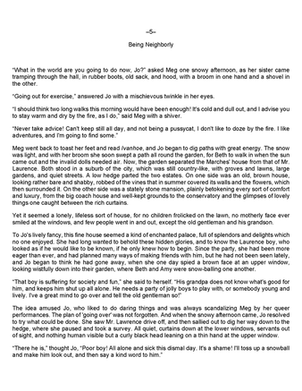
Example 1: It's easy to see what's wrong here.
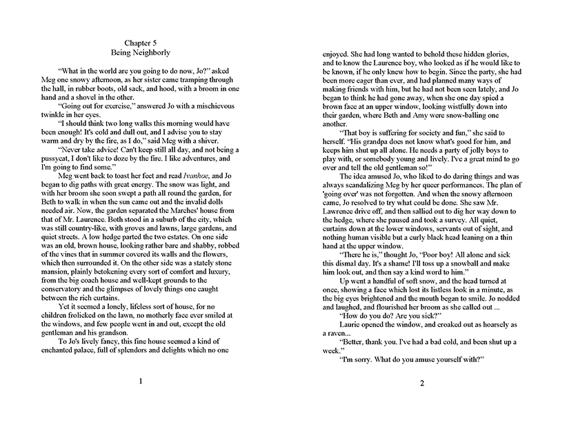
Essentially, this is an undesigned page. It looks cheap and unprofessional. Don't your readers deserve better? Example 2:
This one looks a lot better than the first example. The size (5.5 x 8.5) is better and the 1-inch margins are better. But it could still stand some improvement.
|
Good Book Design
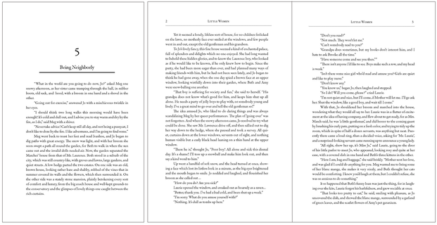
Here's an example of book design that makes the reader's experience pleasant and enjoyable. What went right?
Here's an example of book design that makes the reader's experience pleasant and enjoyable. What went right?
- The page size is smaller, suitable for a trade paperback or an e-reader, and could easily be resized for the smaller mass-market paperback.
- Chapters are clearly set off with sufficient white space and variations in font size.
- Margins are neither too large nor too small—they accommodate the binding, yet would also work on an e-reader comfortably.
- Book title appears on each page, and the numbers are in the upper outside corners, for easy thumbing.
- Font (Garamond) is serif, which guides the eyes along the lines and keeps the reader reading smoothly.
- Paragraphs are indented, which is more readable for longer texts.
